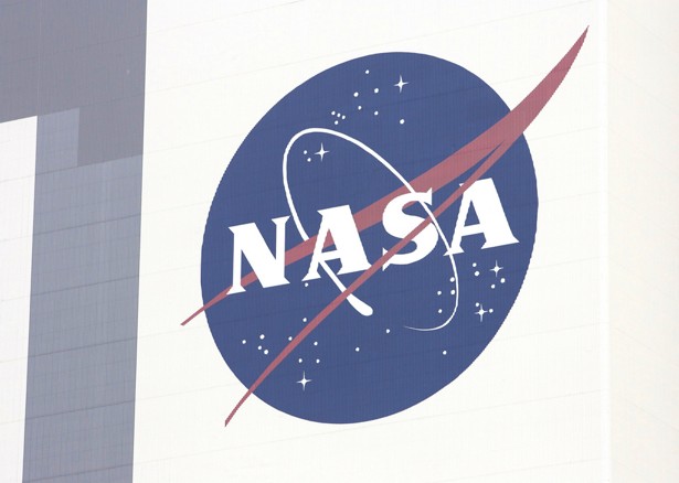
The “meatball” Nasa logo
Continuing the space theme from our post last week about the evolution of the Star Wars logo, here’s a story about how NASA’s logo has changed over time:
“It’s a design nightmare,” Greg Patt, a publishing contractor for NASA, sighed. He was talking about the logo that’s been the space agency’s official one since 1992: the blue sphere meant to suggest both Earth and other planets, its interior sprinkled with stars of white and and belted with the letters N-A-S-A, all of it connected by a swoopingly aeronautical chevron of red.That logo, making news because of a Kickstarter campaign to create a hardcover version of the old, be-bindered NASA Graphics Standards Manual, has come to be known as “the meatball.” That’s in part because of its connection to aeronautics-the optical approach nicknamed the “meatball landing system” has long helped Navy pilots to land on aircraft carriers-but it’s also because of its visual clunkiness. The meatball, originally created to suggest NASA’s ability to move the nation forward into new frontiers, now reeks of retrofuturism.
As such: The meatball has not always been NASA’s official visual signature. Its biggest competition? NASA’s other long-time logo, its now-unofficial one: the logotype, sleek and rounded of edge, that came to be known as “the worm.”
The “worm” Nasa logo